
The most effective approach to workflow visibility is to instrument one high-value process, design clear ownership and stages into the work itself, and automate lightweight status updates so your team sees the real state without extra meetings or manual chasing. Done right, you cut cycle time, reduce escalations, and stop being the human middleware between systems that should talk to each other.
Here are the top practices to start with:
- Walk one process end-to-end before touching any software (a few hours, surfaces most of the real gaps)
- Standardize stages and assign single owners so status is never ambiguous
- Pick a correlation key (order_id, case_id, customer email) early so events stitch across systems
- Instrument six core metrics: throughput, cycle time, wait time, variant frequency, rework rate, and conformance
- Automate status updates with retries and callbacks rather than polling or manual pings
- Create one source of truth by connecting your tools through a shared key, not by duplicating data
- Build runbooks and escalation paths before you need them, tied directly to the alerts that trigger them
- Fix the highest-cost visibility gaps first using existing tooling before buying anything new
The operational outcome: teams that apply these practices typically see faster decision cycles, fewer missed SLAs, and managers who spend time removing obstacles instead of chasing status updates.
Start this week: Pick one process, walk it manually with a colleague, and write down every hand-off point where status becomes unclear.
Key Takeaways
The single most important principle: fix the 1–2 highest-cost visibility gaps in one process first, using existing data and tooling, before scaling to additional processes or platforms.
| Point | Details |
|---|---|
| Walk before you instrument | A 2–4 hour manual walk-through surfaces 60–80% of broken-system issues before any software work begins. |
| Six metrics cover process health | Track throughput, cycle time, wait time, variant frequency, rework rate, and conformance; start with the first two via log mining. |
| Correlation key is foundational | Pick case_id, order_id, or customer email early so events stitch across systems and all six metrics become measurable. |
| Runbooks make dashboards useful | Pair every alert with a runbook covering trigger, investigation steps, escalation path, and resolution notes. |
| Gainable closes the gap fast | Point Gainable at your spreadsheets and CRM data to get a live operations app with dashboards, two-way sync, and alerts in minutes. |
Table of Contents
- What does workflow visibility actually mean?
- How do you design workflows so visibility emerges naturally?
- What KPIs and dashboards should you track?
- How do you automate status updates and handle failures reliably?
- How do you create a single source of truth without tool sprawl?
- Who acts when dashboards show problems?
- What does a 90-day rollout plan look like?
- How Gainable makes workflow visibility practical
- What I have seen go wrong, and what actually fixes it
- Gainable turns your existing data into live workflow visibility
- Sources
What does workflow visibility actually mean?
Visibility is not surveillance, and it is not blanket transparency. The Work Visibility Framework from the Work Management Institute defines it precisely: visibility is a system property that makes work understandable to the right people at the right time. Five progressive levels describe how organizations mature from ad-hoc status-chasing to proactive, system-generated insight.
That definition matters because most teams conflate visibility with more meetings, more dashboards, or more access. None of those fix the underlying problem if the work itself is not designed to surface its own state.
What visibility actually covers:
- Real-time state: where each work item sits right now, not where it was at last week’s standup
- Hand-off seams: the moments between stages where items stall, get lost, or change hands without a record
- Decision history: who approved what, and when, so you can audit and learn
- Data quality: whether the events you are reading reflect what actually happened
Organizations that invest in connected infrastructure and workflow transparency gain faster decisions, improved accountability, and scale more effectively, according to Business Ops Center. The key word is connected: visibility is a system design problem, not a reporting problem.
Pro Tip: Before adding a new tool, ask: “Is this a visibility problem or a capability problem?” If the team knows what to do but cannot see when to do it, that is a visibility gap. If they do not know what to do, adding a dashboard will not help.
How do you design workflows so visibility emerges naturally?
Most visibility problems are structural. The work was never designed to surface its own state, so someone has to manually collect it. The fix is to design visibility in from the start.

The cheapest first move is a manual walk-through. Spend 2–4 hours tracing one end-to-end process with the people who actually do it. According to SideGuy Solutions, this kind of low-tech audit typically surfaces a majority of broken-system issues before any engineering work begins. You will find hand-offs that happen over Slack, approvals that live in someone’s inbox, and status fields that nobody updates.
After the walk-through, apply MIT Sloan’s dynamic work design principles: structure the work to reveal problems, use a scientific approach to fix them, connect front-line employees and managers, and regulate flow. In practice, that means:
- Define discrete stages with a clear entry and exit condition for each (not “in progress” as a permanent state)
- Assign a single owner per stage, not a team, so accountability is unambiguous
- Design atomic state transitions: each stage change should emit one clean event (order_confirmed, review_approved, shipment_dispatched) that a tool can read without interpretation
- Map every hand-off and decide whether it should be automated, human-approved, or eliminated
Pro Tip: Pick your correlation key before you write a single line of automation. An order_id, case_id, or customer email that appears in every system lets you stitch events together later. Without it, you end up with islands of data that cannot be joined.
Quick design checklist for a single workflow pilot:
- Name the process and its start/end events
- List every stage and its owner
- Identify every hand-off (system-to-system and human-to-human)
- Define the event each stage transition should emit
- Confirm the correlation key exists in every system involved
What KPIs and dashboards should you track?
Six metrics cover the health of almost any process. APFX recommends tracking all six once your event logs are stitched, but you can start with the first two using basic log mining.
| Metric | What it measures | Who acts on it | Alert rule |
|---|---|---|---|
| Throughput | Items completed per period | Ops manager | Drop week-over-week |
| Cycle time | Total elapsed time, start to finish | Process owner | Exceeds SLA threshold |
| Wait time | Time items spend idle between stages | Stage owner | >30% of cycle time |
| Variant frequency | How often the process deviates from the standard path | Analyst | New variant >5% of cases |
| Rework rate | Items that return to a previous stage | Quality lead | >10% of throughput |
| Conformance | % of cases that follow the designed path | Ops manager | Below 80% |
The last three metrics (variant frequency, rework rate, conformance) require stitched event logs across systems, which is why the correlation key matters so much. A good event schema contains at minimum: case_id, activity_name, timestamp, and resource. Transform raw logs to this schema at ingestion and you can mine them with any process analytics tool.
On the log mining versus streaming question: APFX advises that log mining covers roughly the bulk of growth-stage company needs before streaming becomes necessary. Start there. Streaming adds real-time alerting but also adds infrastructure complexity. Move to streaming when your SLA windows are shorter than your log-refresh interval.
Two dashboard types serve different audiences:
- Operator dashboard: current queue depth, items past SLA, owner-level status. Updated every 15–30 minutes. Built for action, not analysis.
- Analyst dashboard: cycle time trends, variant maps, rework heatmaps. Updated daily or weekly. Built for diagnosis and improvement.
Atlassian’s workflow management guidance reinforces this: visual boards and reports centralize progress and help identify bottlenecks, but they need clear ownership and continuous improvement routines to stay useful. A dashboard nobody acts on is just decoration.
You can create team dashboards from existing data without a full data engineering project. The key is starting with the data you already have, not waiting for a perfect schema.

How do you automate status updates and handle failures reliably?
Automated updates are only as good as their failure handling. A status that stops updating silently is worse than no automation at all, because it creates false confidence.
Google Cloud Workflows best practices recommend three patterns for resilient automated updates:
- Retries with exponential backoff: when a step fails, retry with increasing delays (1s, 2s, 4s, 8s) up to a maximum. This handles transient failures without hammering a downstream system.
- Callbacks and webhooks: instead of polling a system for a result, register a callback URL and let the system call you when it is done. This eliminates polling loops, reduces false positives, and cuts infrastructure load.
- Saga/compensation pattern: for multi-step workflows, define a compensating action for each step. If step 4 fails, steps 3, 2, and 1 roll back in reverse order. This keeps your data consistent when a long-running process partially fails.
Pro Tip: Use callbacks wherever the downstream system supports them. Polling creates a false sense of real-time visibility and generates noise when a system is slow. A callback fires exactly once, when the event actually happens.
On alert design, the goal is signal, not noise. Practical rules:
- Route alerts by severity: P1 (SLA breach, data loss risk) goes to on-call; P2 (approaching threshold) goes to the stage owner; P3 (informational) goes to a digest
- Aggregate related failures into one alert rather than firing one per item
- Rate-limit alerts so a cascade of failures produces one notification, not fifty
- Include context in every alert: what failed, which case_id, what the next step is
Gaia Autopilot takes this a step further by watching your app data for anomalies and drafting actions for you to approve, so recurring work gets cleared before it piles up.
How do you create a single source of truth without tool sprawl?
Tool sprawl is a visibility killer. Every new tool added without a clear integration plan creates another data island, and someone ends up manually reconciling them. The fix is not fewer tools; it is a clear integration architecture.
The APFX guidance on end-to-end process visibility recommends a narrow-and-deep approach: instrument one process thoroughly before scaling. A single instrumented process builds integration muscle, proves the model, and gives you a template to replicate.
Integration governance checklist:
- Define the canonical event schema (case_id, activity_name, timestamp, resource) before connecting any system
- Assign schema ownership to one person or team; changes require a review
- Filter at the source: only emit events that are relevant to the process you are tracking. Ingesting everything creates noise and storage costs.
- Use two-way sync where possible so the app writes back to the source system instead of creating a separate copy
- Document every mapping: which field in System A maps to which field in System B, and who approved it
On security and privacy: limit event detail to what is operationally necessary. A fulfillment event does not need to carry customer payment data. Apply role-based access controls so each dashboard shows only what its audience needs to see. This is not just a compliance consideration; it also reduces the cognitive load on operators who would otherwise see irrelevant fields.
Pro Tip: Narrow-and-deep beats broad-and-shallow every time. One process with clean, complete event data teaches you more than five processes with patchy coverage. Resist the pressure to instrument everything at once.
Gainable’s data connectors handle HubSpot, Salesforce, Airtable, Jira, Google Sheets, and more, merging them into one unified record by a key you choose. Two-way sync means the app writes back to the source, so you never end up with a stale copy living in a separate tool.
Who acts when dashboards show problems?
A dashboard without a response plan is just a scoreboard. The operational layer that makes visibility useful is roles, runbooks, and escalation paths.
| Role | Responsibility | Alerts they own |
|---|---|---|
| Stage owner | Resolves items stuck in their stage | Wait time exceeded, item returned |
| Ops manager | Clears cross-stage blockers, adjusts capacity | Throughput drop, SLA breach |
| On-call engineer | Handles system failures and data gaps | P1 automation failures, data loss |
| Process analyst | Investigates variant and rework trends | Conformance below threshold |
A runbook for each alert type should cover: the trigger condition, the first three investigation steps, the escalation path if unresolved in N minutes, and a field for resolution notes. Keep runbooks short. A runbook that takes ten minutes to read will not be used under pressure.
Atlassian recommends pairing workflow platforms with documentation, ownership, and continuous improvement routines. The Work Management Institute adds that effective leaders design systems so information surfaces naturally, freeing managers to remove obstacles rather than chase updates.
Practical routines that keep visibility operational:
- Daily huddle (15 minutes): review the operator dashboard, clear items past SLA, assign owners to blockers
- Weekly deep-dive (45 minutes): review analyst dashboard trends, identify the top variant or rework driver, assign one improvement action
- On-call rotation: tied to P1 and P2 alerts, with a clear handoff protocol
Pro Tip: Store runbooks in the same tool that surfaces the alert. If your dashboard fires an alert, the runbook link should be one click away. A runbook buried in a wiki nobody opens is the same as no runbook.
What does a 90-day rollout plan look like?
The fastest path to visible results is a focused pilot on one high-value process. Here is how to structure it.
Weeks 1–2: Discovery
- Walk the process manually (2–4 hours)
- Map every stage, owner, and hand-off
- Identify the correlation key
- Define the six core metrics and their current baseline
Weeks 3–4: Instrument
- Define the event schema (case_id, activity_name, timestamp, resource)
- Connect the first data source (start with log mining)
- Build the operator dashboard with throughput and cycle time
Weeks 5–8: Validate and iterate
- Run the dashboard live with the ops team
- Identify the top 1–2 visibility gaps and fix them with existing tooling
- Add wait time and rework rate once the first two metrics are stable
Weeks 9–12: Scale
- Add the analyst dashboard (variant frequency, conformance)
- Document runbooks for the top three alert types
- Decide whether streaming is needed based on SLA window vs. log-refresh interval
- Replicate the model to a second process
Pilot success metrics:
Quick wins that cost almost nothing:
- Add a status field to your existing spreadsheet or CRM record and make it mandatory
- Set up one Slack or email alert for items past SLA using your existing tool’s built-in notifications
- Run the manual walk-through audit before any engineering work begins
The SideGuy Solutions audit approach confirms that adding more tools without fixing the highest-cost visibility gaps first often creates new opacity layers. Fix the most expensive 1–2 gaps using existing tooling before investing in anything new.
How Gainable makes workflow visibility practical
The before state is familiar: a sales ops team tracks pipeline in a Google Sheet, fulfillment updates live in a separate Excel file, and customer status exists only in someone’s head or a CRM field nobody trusts. Hand-offs happen over email. Status is always a meeting away.
The after state with Gainable: point the platform at your spreadsheet and CRM data, and it builds a live application from what is already there. No prompts, no custom development. Your columns become the spec.
What that looks like in practice:
- Live dashboards built from your Google Sheets, Excel, HubSpot, Salesforce, or Jira data, updated in real time
- Two-way sync so the app writes back to the source; the spreadsheet stays current without a separate export step
- Single unified record merged by a key you choose (customer email, order_id), pulling from multiple sources at once
- Embedded comments and chat sitting next to the record they refer to, replacing the email thread that nobody can find later
- Gaia Autopilot watching for anomalies and drafting actions for approval, clearing recurring work before it accumulates
A collections team, for example, moves from a shared Excel file with no status column and daily “where are we?” emails to a Gainable app with live account status, owner assignment, and an alert when an account goes 10 days without activity. The hand-off seam that used to cause a data blackout becomes a visible, auditable event.
Build a team app without hiring a developer and see how non-technical teams are closing visibility gaps with data they already own.
What I have seen go wrong, and what actually fixes it
The most common mistake is buying a tool before instrumenting the process. Teams spend weeks evaluating platforms, then discover the underlying data is too messy to surface anything useful. The dashboard goes live, nobody trusts the numbers, and the tool gets abandoned. The manual walk-through audit is not glamorous, but it is the intervention that consistently produces the fastest results.
The second mistake is trying to fix everything at once. A team that instruments five processes simultaneously ends up with five half-instrumented processes and no clear wins. The teams that make the most progress pick the one process where a visibility gap is costing the most, fix it completely, and then move to the next.
The third mistake is treating metrics as reporting rather than as triggers for action. Cycle time on a dashboard is useful only if someone is accountable for acting when it exceeds the SLA. Without runbooks and clear ownership, dashboards become wallpaper. The dynamic work design principles from MIT Sloan are useful here: connect front-line employees and managers through the same visibility layer, and make the response to a metric as standardized as the metric itself.
The fix is often a status field, a single alert, and a clear owner. Not a platform migration.
Gainable turns your existing data into live workflow visibility
If you have been running your operations on spreadsheets and CRM exports, you already have the data you need. What you are missing is a live surface that shows it in real time, with ownership, alerts, and collaboration built in.
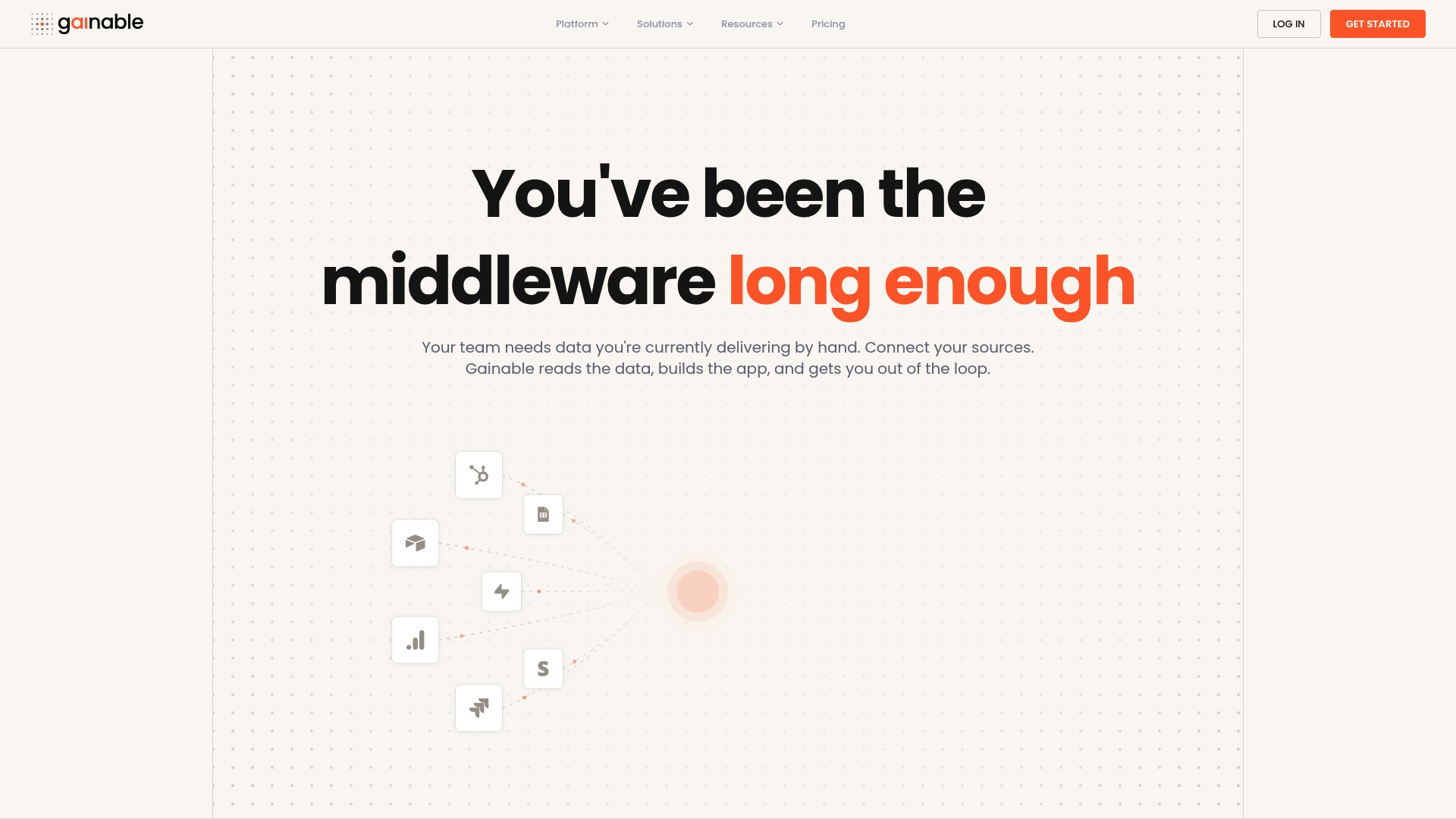
Gainable reads your Excel files, Google Sheets, HubSpot records, Salesforce data, and more, merges them into a single data model, and builds a working operations app from what is already there. No engineering team required. The app builder generates dashboards, audit logs, and role-based access in minutes. Gaia Autopilot watches for anomalies and drafts responses before the backlog builds. Two-way sync keeps your source data current automatically.
Drop your spreadsheet at Gainable and see your first live app in minutes.
Sources
The sources below support the frameworks, patterns, and techniques covered in this article. Use them for deeper technical or theoretical grounding.
- Work Visibility Framework™ | Work Management Institute
- Visibility Is the Real Workflow Problem — Most Systems Aren’t Broken, They’re Just Invisible (2026)
- Get work back on track with visual management | MIT Sloan
- How to Create End-to-End Process Visibility | APFX
- Workflows best practices | Google Cloud
- Workflow management | Atlassian