
An operations dashboard is a live visual interface that pulls together operational data, such as system uptime, work orders, or inventory levels, so teams can spot problems and act on them within minutes instead of days. The primary payoff is speed: real-time visibility replaces guesswork with a screen everyone trusts. Tools like the SQL Server Performance Dashboard, ArcGIS Dashboards, and various platforms all serve this same goal, just at different layers of the business.
TL;DR:
- Most effective operations dashboards use a three-layer model to provide quick insights, drill-down options, and raw data for investigators.
- Real-time updates are critical for IT and warehouse monitoring, while inventory and sustainability metrics can refresh every 15 to 60 minutes.
- Building trustworthy dashboards requires clear scope, consistent data sources, defined thresholds, and ownership tested through real incidents.
- Connecting dashboards to existing spreadsheets and BI tools via APIs ensures scalability, accuracy, and seamless data flow across teams.
- Security and access controls should be set up from the start, especially when combining sensitive customer, financial, or safety data.
Table of Contents
- What Makes a Dashboard “Operational” Instead of Analytical?
- What Do Operations Dashboards Look Like by Function?
- Which KPIs and Data Sources Actually Deserve a Dashboard Slot?
- How Do You Actually Build and Roll Out an Operations Dashboard?
- How Gainable Turns a Spreadsheet Workflow Into a Live Dashboard
- How Should an Operations Dashboard Connect to Your Other BI Tools?
- Are Operations Dashboards Secure Enough for Sensitive Data?
- Can Operations Dashboards Grow With Your Business?
- When Should You Move Fast vs. Build for Scale?
- How Gainable Gets You From Spreadsheet to Live Dashboard Faster
- Sources
- FAQ
What Makes a Dashboard “Operational” Instead of Analytical?
The distinction comes down to who looks at it, how fast it updates, and what happens next.
An analytical dashboard is built for a quarterly business review. It refreshes daily or weekly, gets used by analysts and executives, and supports decisions measured in weeks. An operations dashboard refreshes in seconds or minutes, gets used by frontline managers and shift leads, and supports decisions measured in minutes. You’re not asking “how did we do last quarter?” You’re asking “is the warehouse backing up right now, and who needs to fix it?”
Most solid operations dashboards follow a three-layer information model, a structure the Jaspersoft breakdown of performance dashboards lays out clearly:
- Summary layer: graphical, at-a-glance metrics (a status light, a gauge, a trend line)
- Dimensional layer: the same metric sliced by team, region, or asset
- Transactional layer: the raw record behind the number, one click away

That layering matters because it keeps the dashboard usable. Cram transactional detail into the top view and you’ve built a spreadsheet with extra colors. The three-layer model gives frontline staff a fast read and gives investigators a path to drill down without leaving the screen. Done right, the outcomes are consistent across industries: faster incident detection, tighter SLA compliance, and better balancing of people and resources across shifts.
If you’re starting from zero on the design side, our non-technical guide to building dashboards that work covers how to pick the question each panel answers before you pick the chart.
What Do Operations Dashboards Look Like by Function?
The KPIs on an operations dashboard change completely depending on what the team is running. Here’s how six common disciplines typically structure theirs:
-
IT operations. These dashboards track uptime, CPU and I/O load, expensive database queries, and open incident queues. The SQL Server Performance Dashboard is a textbook example: it surfaces waiting requests, I/O stats, and missing-index recommendations so a DBA can catch a slowdown before users notice.
-
OKR tracking. Rather than raw system metrics, these show objective completion percentages, key result trend lines, and a panel breaking down which team is contributing to (or dragging down) each target. The refresh cadence is slower here, usually daily, since OKRs move over weeks, not minutes.
-
Health and safety. These panels center on incident rate, inspection compliance percentage, and a live queue of open corrective actions. Miss a compliance deadline here and it’s not just an operational gap, it’s a regulatory one.
-
Sustainability. Energy consumption trends, emissions progress against a stated target, and site-by-site comparisons dominate these dashboards. Because utility data often lags by a billing cycle, these tend to run on a near-real-time cadence rather than a true live feed.
-
Inventory. Stock levels, turnover rate, automated reorder alerts, and stockout risk scoring are the core widgets. The best versions flag risk before the shelf actually goes empty.
-
Warehouse operations. Live throughput, pick and pack rates, and backlog depth by queue are the standard view. Some warehouse dashboards borrow location intelligence from tools like ArcGIS Dashboards to show which dock or zone is creating the bottleneck, particularly useful across multi-site operations where geography itself is part of the problem.
Which KPIs and Data Sources Actually Deserve a Dashboard Slot?
Most operational KPIs fall into six categories: availability, throughput, quality, timeliness, cost, and compliance. The mistake teams make is trying to put all six on one screen. A dashboard that tries to answer every question ends up answering none of them well.
The data behind these KPIs typically comes from a mix of systems: ERP for cost and inventory, CRM for customer-facing timeliness, ticketing systems for incident volume, telemetry feeds for uptime, and, for a lot of teams, spreadsheets that never got fully replaced. That last one is the quiet reality of most operations. The spreadsheet is still where the canonical customer list or the master reorder threshold lives, and any dashboard project has to connect to it rather than pretend it doesn’t exist.
Pro Tip: Before building anything, pick a canonical key, like customer ID or SKU, and confirm every data source uses it consistently. A dashboard built on mismatched keys will quietly show wrong numbers for months before anyone notices.
Real-time and near-real-time differ; true real-time with sub-minute refresh suits IT incidents and warehouse throughput, where delays cause significant issues. Near-real-time updating every 15 to 60 minutes often suffices for inventory and sustainability monitoring, and is more cost-effective.
Before adding a KPI to the dashboard, run it through a short filter:
- Does someone change behavior based on this number within the hour?
- Is there a single, trustworthy data source for it?
- Can it be shown clearly in one glance, without a footnote?
If the answer to any of those is no, that metric probably belongs in a weekly report, not a live panel.
How Do You Actually Build and Roll Out an Operations Dashboard?
Most failed dashboard projects don’t fail on the visualization. They fail on scope and ownership. Here’s a sequence that avoids both:
-
Define the operational question first. Who’s looking at this, and what decision are they making? Limit the first version to 3 to 5 KPIs. A dashboard trying to answer ten questions answers none of them fast enough to matter.
-
Inventory your data sources. List every system that touches the metrics you picked, ERP, CRM, ticketing, spreadsheets, and mark which one is the canonical source for each field. Conflicting sources for the same number is the single most common reason dashboards lose trust.
-
Set refresh cadence and alert thresholds. Decide upfront what counts as a warning versus a crisis, and who gets pinged when a threshold breaks.
-
Design summary cards, queue views, and drill-downs. Every problem shown on the screen should be one click from the action that fixes it, acknowledging an alert, opening a work order, reassigning a shift.
-
Assign an owner and test with a real incident. Roll it out to one team first, watch what breaks during an actual operational event, then expand.
Pro Tip: Run your first dashboard through a live incident before declaring it done. A dashboard that looks great in a demo but goes stale during a real outage isn’t ready, no matter how clean the charts look.
The most common pitfalls: letting analytical curiosity creep into an operational panel, tolerating stale data because “it’s close enough,” and skipping ownership until something breaks and nobody knows who’s responsible for the fix. Our guide on workflow visibility best practices goes deeper on keeping that ownership trail intact once more than one team is watching the same screen.
How Gainable Turns a Spreadsheet Workflow Into a Live Dashboard
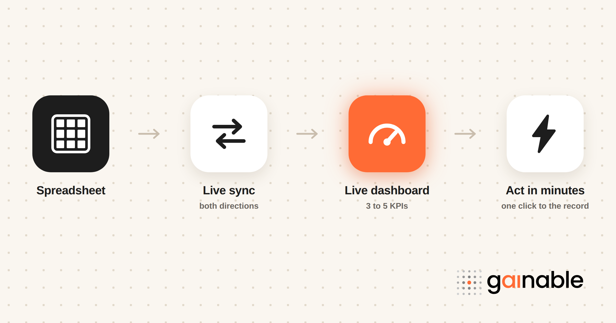
A lot of operations teams already have the KPI logic they need. It’s just trapped in a spreadsheet that someone updates by hand every morning. Gainable reads that spreadsheet, whether it’s Google Sheets, Excel, or both, merges it with data from tools like HubSpot, Stripe, or Salesforce using a key you choose, and builds a working dashboard from the structure that’s already there.
The practical difference shows up in a few places:
- Sync runs both ways, so the app writes back to the original spreadsheet instead of leaving it stale the moment someone edits a record.
- When you merge two sources, you set the merge key yourself, email or customer ID or SKU, and you set which source wins when the same field disagrees. That’s the mismatched-key problem handled at setup instead of discovered three months in.
- Chat, comments, and file sharing sit next to the record they refer to, so a flagged issue doesn’t need a separate email thread to explain it.
- Gaia Autopilot watches the live data for anomalies and drafts the follow-up action for a human to approve. Every trigger, tool call, and outcome lands in the action log, and the pending-draft queue can sit on the dashboard itself as a widget.
How Should an Operations Dashboard Connect to Your Other BI Tools?
An operations dashboard shouldn’t live in isolation from the rest of your business intelligence stack. It’s the fast, tactical layer sitting on top of the slower, deeper analytical tools your finance or strategy teams already use.
The practical integration usually runs through APIs or shared data connectors rather than manual exports. Your operations dashboard pulls a live feed from the ERP or CRM, while your analytical BI platform pulls a scheduled, aggregated version of the same underlying data for trend analysis and forecasting. Keeping both fed from the same canonical source avoids the classic problem where the ops dashboard says one number and the monthly BI report says another, and nobody can explain why.
Where this gets genuinely valuable is in closing the loop. A dashboard that shows a spike in support tickets is more useful when that spike automatically feeds into a model tracking customer churn risk, rather than sitting as an isolated screen someone has to remember to check. The mechanics of that merge, and where it tends to break, are covered in our piece on how multi-source data apps merge business data.
The practical move for most teams: pick one platform to hold canonical keys and definitions, connect everything else to it through APIs rather than manual exports, and treat any dashboard that pulls from a second, unsynced copy of the data as a liability waiting to surface at the worst time. This also determines how well your dashboards scale as you add more data sources over time, since a tangle of point-to-point exports gets unmanageable fast, while a shared connector layer doesn’t.
Are Operations Dashboards Secure Enough for Sensitive Data?
Operations dashboards often expose data that’s more sensitive than people assume: customer contact details, financial thresholds, employee safety incidents, or supplier pricing. Treating a dashboard as “just an internal tool” and skipping the security review is one of the more common mistakes teams make.
At minimum, an operations dashboard needs role-based access control so a warehouse supervisor sees throughput data without also seeing payroll figures pulled from the same underlying system. Authentication should match whatever standard the rest of your business tools use, not a separate, weaker login layer bolted on because the dashboard was “just for internal use.” Audit logs matter more here than people expect, because when a number looks wrong, the first question is always who changed the underlying data and when.
Data privacy considerations widen further once a dashboard blends multiple sources. A dashboard combining CRM data with support tickets and financial figures is handling several categories of sensitive information at once, which means whichever compliance obligations apply to the most sensitive category (often the financial or customer data) apply to the whole dashboard, not just the piece that triggered it.
The practical takeaway: build access control and audit logging into the dashboard from day one rather than retrofitting it after the first uncomfortable question about who saw what. It’s far easier to design permissions around the data model up front than to unwind broad access later.
Can Operations Dashboards Grow With Your Business?
A dashboard built for ten users tracking one warehouse rarely survives unchanged once the company adds three more sites. Scalability isn’t just about handling more data volume. It’s about whether the underlying structure can absorb new KPIs, new teams, and new data sources without a full rebuild.
The dashboards that scale well tend to share one trait: they were built on a flexible data model from the start, rather than hardcoded to one specific spreadsheet layout or one specific source system. Adding a new warehouse location should mean adding a filter, not rebuilding the whole view. Adding a new KPI should mean adding a card, not renegotiating the entire data pipeline.
Customization matters just as much as scale. Different teams looking at the same underlying operational data usually need different views: a shift lead wants the queue view, a regional manager wants the dimensional rollup, and an executive wants the summary card. A dashboard platform that lets you build multiple views off one canonical dataset, rather than maintaining three separate dashboards that can drift out of sync, saves real maintenance headaches down the line.
The practical test before you commit to a platform: ask how much work it takes to add a new data source or a new team view six months from now. If the answer involves rebuilding from scratch, you’ve picked a tool that solves today’s problem while creating next year’s.
When Should You Move Fast vs. Build for Scale?
Speed wins when there’s an urgent operational gap. Deploy a focused, three-KPI dashboard now, and don’t wait for the perfect data model. The mistake is stopping there. Sketch a rough roadmap toward a governed operational layer early, even if you’re a small team with limited engineering time. Otherwise you end up maintaining five disconnected dashboards nobody trusts.
— Rickard
How Gainable Gets You From Spreadsheet to Live Dashboard Faster
There is a direct route from the spreadsheet you maintain now to a working operations dashboard, and it doesn’t run through hiring a developer or keeping the manual morning update alive. Point Gainable at a Google Sheets or Excel file, or at HubSpot, Stripe, Salesforce, Airtable, Jira, or Linear, and it reads the structure that’s already in the data, merges the sources on a key you choose, and builds the app around what it finds. No prompt to write, no blank canvas to fill.
What comes out is a real application: authentication, role-based access, KPI cards, charts, drill-downs to the underlying record, and audit logs, built from the columns you already have. The data connectors keep everything synced both ways, so the app never drifts from the spreadsheet your team still trusts. Gaia Autopilot watches the live data for anomalies and drafts the follow-up action for someone to approve, so the recurring cleanup work doesn’t pile back up on your desk.
If your dashboard project has been stuck at “we should really build this,” start by pointing Gainable at the spreadsheet you already have.
Sources
- ArcGIS Dashboards | Data Dashboards: Operational, Strategic, Tactical, Informational
- What is a Performance Dashboard? | Jaspersoft
FAQ
What Are Operational Dashboards?
An operational dashboard is a live screen that tracks the metrics a frontline team needs to act on right now, such as system uptime, ticket queues, or inventory levels, refreshing in real time or near real time rather than daily or weekly.
What Are the Four Types of Dashboards?
Dashboards are commonly grouped into operational, analytical, strategic, and tactical types, distinguished mainly by refresh speed, audience, and how far ahead the decisions being made actually look.
Can You Give an Example of an Operational Dashboard?
A warehouse dashboard showing live throughput, pick and pack rates, and backlog depth by queue is a common example, and an IT dashboard like the SQL Server Performance Dashboard tracking CPU load and expensive queries is another.
What Are the Top Dashboard Tools?
There’s no single ranked list, but widely used approaches include the SQL Server Performance Dashboard for database operations, ArcGIS Dashboards for location-based operations, Jaspersoft-style performance dashboard frameworks, and platforms like Gainable for teams building dashboards directly from spreadsheets and connected tools.
How Fresh Does Operations Dashboard Data Need to Be?
It depends on the use case. IT incidents and warehouse throughput usually need sub-minute updates, while inventory and sustainability tracking often work fine on a 15 to 60 minute refresh cycle.