

The five most useful team output tracking examples are: a Task Throughput Tracker, a Cycle-Time & Flow Tracker, a Time & Utilization Tracker, a Quality & Rework Tracker, and a Financial Output / Profitability Tracker. One decision rule covers most situations: if your team bills clients, start with the Financial Output tracker; if you ship work in sprints, start with the Cycle-Time tracker.
Here’s which template fits which team:
- Task Throughput Tracker — consulting and ops teams (5–20 people) managing high task volume
- Cycle-Time & Flow Tracker — dev and engineering teams running sprints or Kanban boards
- Time & Utilization Tracker — agencies and professional services tracking billable hours
- Quality & Rework Tracker — creative, QA, and content teams where revision counts matter
- Financial Output / Profitability Tracker — finance and client-facing teams watching margin
Pro Tip: Pick one template and run it for two weeks before adding a second. Parallel trackers with no shared data model create the same reporting chaos you’re trying to escape.
Table of Contents
- How do you pick 3–5 KPIs that actually drive decisions?
- What does a minimal data model look like for a tracking app?
- Five tracker templates you can copy right now
- How do integrations and two-way sync actually work?
- 6-step migration checklist: spreadsheet to collaborative app
- Exact CSV headings and a sample row you can drop into an app
- What mistakes do teams make when tracking output?
- Key Takeaways
- Why the template matters less than the data model behind it
- Your spreadsheet is already most of a working app
- Useful sources and further reading
How do you pick 3–5 KPIs that actually drive decisions?
Team performance metrics fall into five categories: capacity, delivery quality, financial health, output quality, and sustainability. Your anchor set should pull one or two from that list, not one from every category.
Start with outcome KPIs. For a client-facing agency, that’s project profitability, on-time delivery rate, and client retention. For a product team, it’s cycle time, planned-to-done ratio, and defect rate. Activity metrics like hours logged or tasks opened are explanatory signals, not anchors. They tell you why an anchor moved, not whether the business is healthy.
Performance dashboards work best when you pair each outcome KPI with one activity metric for diagnosis. A useful shorthand for interpreting your anchors:
- Exemplary: consistently above target for 3+ consecutive weeks
- Good: within 10% of target
- Immediate action: two consecutive weeks below target
High utilization can coexist with poor profitability when teams are loaded with low-margin work. That’s why profitability belongs in every anchor set for billable teams, not just as a monthly finance report.
Pro Tip: Surface your 3–5 anchor KPIs in a 30-minute weekly review. Tie one concrete action item to any metric that hits “immediate action” status. Reviews without actions are just status theater.
What does a minimal data model look like for a tracking app?
The cleanest approach uses a star schema: one fact table capturing every work entry, surrounded by dimension tables for context. This structure makes dashboards fast, joins reliable, and reporting flexible without rebuilding your schema every quarter.
Core fact table fields:
| Column | Type | Example Value |
|---|---|---|
| EntryID | String | — |
| UserID | String | USR-007 |
| ProjectID | String | PRJ-041 |
| TaskID | String | TSK-209 |
| Date | Date (ISO) | 2024-11-15 |
| Hours | Decimal | 3.5 |
| Status | Enum | Done |
| Billable | Boolean | TRUE |
| OutputType | String | Design Review |
| QualityFlag | Boolean | FALSE |
Dimension tables you need: Users (name, role, team), Projects (client, budget, start/end), Tasks (category, priority), and a Date table for gap-free time-series slicing. Optional lookups include payment type and priority tier.
A middleware layer, such as Apps Script or a lightweight ETL, is often necessary to extract embedded project metadata from spreadsheet name strings and prevent missing-date errors in your dashboard slicers.
Pro Tip: Before importing any CSV, validate that every UserID and ProjectID in the fact table exists in the corresponding dimension table. Orphaned IDs are the single most common cause of broken dashboard joins.
Five tracker templates you can copy right now
Template 1: Task throughput tracker

Fields: TaskID, AssigneeID, ProjectID, DateCreated, DateCompleted, Status, Priority, BlockingReason.
Dashboard: throughput per week (tasks completed), top blocking tasks by frequency.
Playbook: (1) Flag any task open longer than your team’s average cycle. (2) Review the top three blocking reasons weekly. (3) Archive tasks with no activity in 14 days to keep the backlog honest.
Template 2: Cycle-time & flow tracker
Fields: TaskID, StartTimestamp, FinishTimestamp, CycleTime (calculated), WIPCount, Stage, AssigneeID.
Dashboard: cumulative flow diagram by stage, average cycle time trend.
Playbook: (1) Cap WIP at team size minus one. (2) When cycle time spikes, check the stage with the longest average queue. (3) Move one blocked item per day before pulling new work.
Template 3: Time & utilization tracker
Fields: EntryID, UserID, ProjectID, PlannedHours, ActualHours, Billable, WeekOf.
Dashboard: utilization % per person, available capacity by week, billable vs. non-billable split.
Playbook: (1) Flag anyone below 60% billable utilization for two consecutive weeks. (2) Use available capacity data to assign new work before it hits the queue. (3) Compare planned vs. actual hours monthly to sharpen future estimates.
Template 4: Quality & rework tracker
Fields: DeliverableID, ProjectID, RevisionCount, FirstPassAccepted (boolean), ReviewerID, ReworkReason.
A complete productivity report needs quality flags and manager notes, not just hours. This template captures exactly that.
Dashboard: revision trend over time, rework hot spots by project or deliverable type.
Playbook: (1) Set a first-pass acceptance target (e.g., 80%). (2) When a deliverable type shows 3+ revisions consistently, schedule a brief spec review. (3) Track rework reasons to find upstream process gaps.
Template 5: Financial output / profitability tracker
Fields: ProjectID, RevenueAmount, CostHours, HourlyRate, Margin (calculated), QuotedHours, ActualHours.
Dashboard: project-level margin, quote vs. actual hours variance, margin trend by client.
Playbook: (1) Flag any project where actual hours exceed quoted by more than 15%. (2) Review the lowest-margin projects in your monthly pricing discussion. (3) Connect time logged to budget data so margin is visible in real time, not just at month-end.
Pro Tip: Build each template as a separate view on the same fact table. Switching between them becomes a filter change, not a new spreadsheet.
How do integrations and two-way sync actually work?
Common source systems worth connecting: Google Sheets, Excel exports, Jira or Linear for issue data, time-tracking APIs, and Stripe or Salesforce for revenue figures. Each has a different sync pattern.
Structured spreadsheets work well as staging points when you keep all source data in one cleaned table and use dashboards for summaries. That discipline makes the import predictable.
One-way vs. two-way sync:
| Pattern | Best for | Trade-off |
|---|---|---|
| One-way import | Historical archives, weekly snapshots | Safe, but data goes stale between imports |
| Two-way sync | Live updates, billing fields, status changes | Requires conflict resolution and trust in data quality |
Two-way sync is worth the complexity when a field in your app needs to update the source system, such as writing a “Billed” status back to a Jira ticket or updating a Salesforce opportunity stage. For everything else, a scheduled import is simpler and less risky. Gainable’s data connectors handle both patterns and write back to the source on a key you choose.
Pro Tip: Run scheduled imports for the first two weeks. Enable live sync only after you’ve confirmed data quality is stable. Turning on two-way sync before your IDs are clean creates a feedback loop of bad data.
6-step migration checklist: spreadsheet to collaborative app
- Audit source spreadsheets (1–2 days). Identify which rows are fact entries and which columns are dimension lookups. Flag duplicates and inconsistent IDs now.
- Build fact and dimension tables in CSV (1–3 days). Export cleaned CSVs for the fact table and each dimension. Validate referential integrity before moving on.
- Create base app records and entry forms (1–3 days). Set up default project pickers, status dropdowns, and required fields to make logging fast.
- Connect integrations and validate with test data (2–5 days). Run a test import, check for missing dates and orphaned IDs, and confirm dashboard slicers work correctly.
- Pilot with one team for 1–2 sprints (2–6 weeks). Collect feedback on form friction and missing fields. Iterate before rolling out broadly.
- Roll out with governance and a weekly review rhythm (2–4 weeks). Define naming conventions, access controls, and a rollback plan.
One ops team reduced their reporting cycle from 1–2 weeks to roughly 10 minutes after automating their pipeline. The migration itself took less than a month.
Governance tips that prevent rollout failure:
- Assign one data owner per dimension table
- Use a canonical ID format from day one (e.g., PRJ-001, USR-001)
- Keep a read-only copy of the original spreadsheet for 30 days as a rollback option
- Schedule the weekly review before the pilot ends, not after
Pro Tip: The pilot step is where most migrations succeed or fail. Two weeks with one real team surfaces every edge case your audit missed.
Exact CSV headings and a sample row you can drop into an app
Copy this header row directly:
EntryID, UserID, ProjectID, TaskID, Date, StartTime, EndTime, Hours, Billable, Status, QualityFlag, Notes
Sample row:
WE-001, USR-007, PRJ-041, TSK-209, 2024-11-15, 09:00, 12:30, 3.5, TRUE, Done, FALSE, "Initial design review"
Quick cleaning rules before you import:
- Dates: use ISO format (YYYY-MM-DD). Non-ISO dates cause silent import failures.
- IDs: map every UserID and ProjectID to your dimension tables before uploading.
- Deduplication: sort by EntryID and remove exact duplicates. Near-duplicates (same user, project, date, hours) need manual review.
- Whitespace: trim leading and trailing spaces from all ID fields. A space after “PRJ-041” creates a new, unmatched record.
- Required fields: EntryID, UserID, ProjectID, and Date must never be blank.
Employee productivity reports often miss quality flags and manager notes in their field lists. Including QualityFlag and Notes from the start saves a painful schema migration later.
Pro Tip: Validate your CSV in a staging sheet before the first import. One bad row with a blank EntryID can block the entire upload depending on your app’s validation rules.
What mistakes do teams make when tracking output?
Tracking too many metrics. The fix is reducing to 3–5 anchor KPIs and retiring the rest. Every metric you keep has a maintenance cost: someone has to explain it, defend it, and act on it. If no one can name the action a metric triggers, cut it.
Poor data hygiene and inconsistent IDs. Enforce validation rules at the form level, not after the fact. A canonical dimension table with locked ID formats stops the problem before it reaches your dashboard.
Framing tracking as surveillance. Adoption rises when metrics are team-level and tied to workload balancing, not individual scorecards. Make every dashboard visible to the whole team, not just managers.
Skipping the pilot. A 30-minute weekly metrics review during the pilot builds the habit before the full rollout. Teams that skip this step often abandon the tracker within 60 days.
Red flags that mean you should pause the rollout:
- Team members are entering data inconsistently or gaming status fields
- More than 20% of entries have blank required fields after two weeks
- Dashboard numbers contradict what the team knows to be true from memory
Tracking should feel like a mirror, not a microscope. When the team sees their own data and uses it to push back on unrealistic workloads, the tracker has done its job. When they hide from it, the design is wrong.
Key Takeaways
Choosing the right tracker template and building a clean fact table from your existing spreadsheet is the fastest path to reliable team performance metrics.
| Point | Details |
|---|---|
| Pick one template first | Match the template to your team type: financial for client-facing, cycle-time for sprint teams. |
| Build a clean fact table | One row per work entry, with dimension tables for users, projects, and tasks. |
| Pilot before full rollout | Run one team for 1–2 sprints to catch data quality issues before they scale. |
| Keep 3–5 anchor KPIs | Retire any metric that doesn’t trigger a concrete action in your weekly review. |
| Gainable accelerates migration | Point Gainable at your spreadsheet and it builds a working app with dashboards and two-way sync. |
Why the template matters less than the data model behind it
Most teams spend their energy choosing the right dashboard and almost none on the schema underneath it. That’s backwards. A well-designed fact table with clean dimension tables will outlast any dashboard redesign. The template is just a view on top of that foundation.
The ops teams that cut their reporting cycles most dramatically weren’t using fancier tools. They were the ones who stopped treating their spreadsheet as the final destination and started treating it as the input to something better. The weekly review ritual mattered more than the visualization. Consistent data entry mattered more than the number of KPIs tracked.
If you’re still acting as the human middleware between your spreadsheet and your team’s decisions, the problem isn’t the template you chose. It’s that the data hasn’t been given a permanent home yet.
Your spreadsheet is already most of a working app
If you’ve been putting off the migration because building a tracker app sounds like a six-month project, Gainable changes that math. Point it at your Excel file or Google Sheet, and it reads your columns, merges them into a data model, and generates a working application from what’s already there.
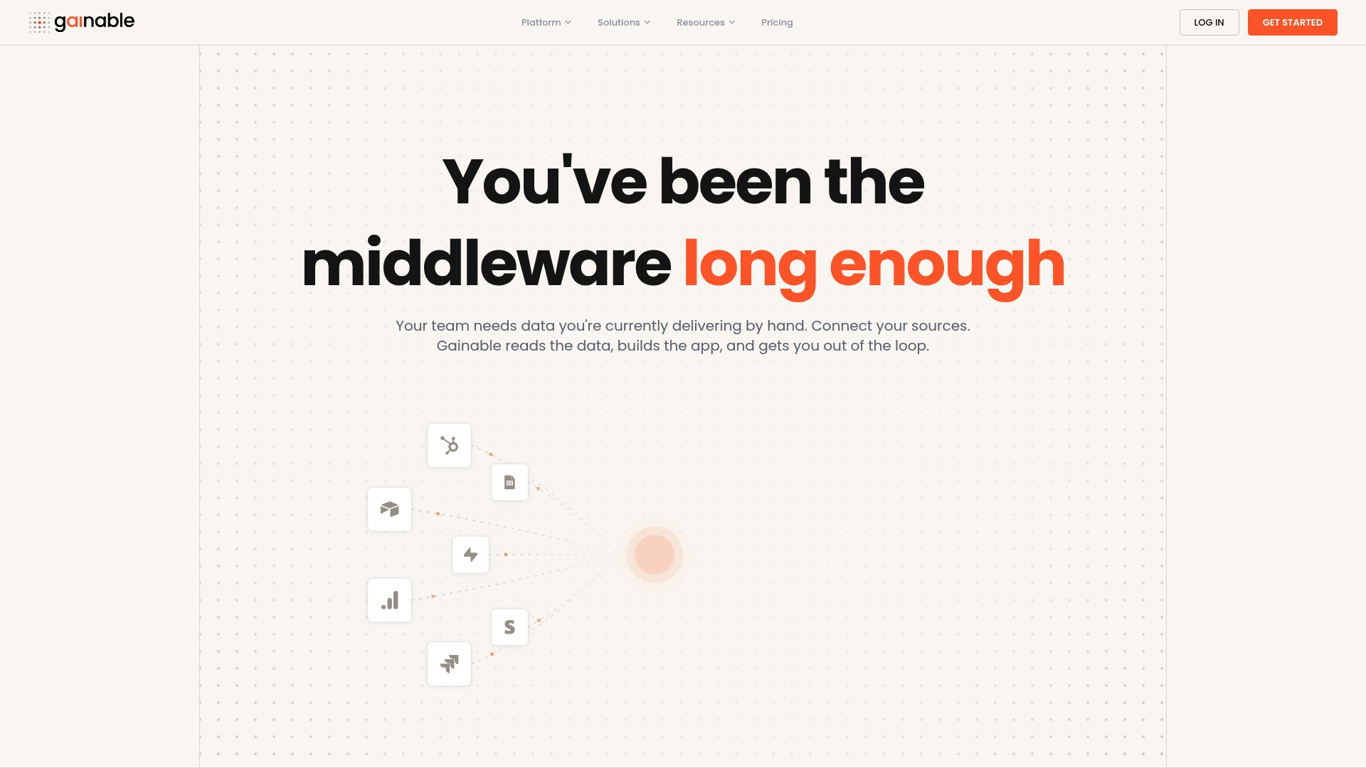
For operations teams, that means a live operations tracking app with dashboards, audit logs, and collaboration built in, without starting from scratch. Two-way connectors keep Jira, Salesforce, Stripe, and Sheets in sync. Gaia Autopilot watches for anomalies and drafts actions before they pile up. A typical pilot runs two weeks with one team and delivers a canonical fact table, a working dashboard, and a measurable reduction in manual reporting time.
Drop your spreadsheet at gainable.dev and see what your data already knows.
Useful sources and further reading
- Team performance metrics that actually tell you what works — Teamwork’s guide to KPI categories, anchor metrics, and threshold interpretation for team trackers.
- Kimball Group dimensional modeling guidance — The authoritative reference for star schema design, fact tables, and dimension table best practices.
- ZeyaMosharraf/ops-performance-dashboard — A real ops dashboard repo showing how middleware and ETL reduce a 1–2 week reporting cycle to roughly 10 minutes.
- Team Performance KPIs and benchmarks — KPI Depot’s definitions, formulas, and benchmark bands for outcome-focused team metrics.
- How to measure team productivity: an Excel guide — Practical advice on keeping source data in one structured table and using PivotTables for summaries.
- Employee productivity report template — Superworks’ field-level guidance on what a complete productivity report needs beyond hours logged.
- No-code dashboard builders for operations teams — Gainable’s comparison of no-code options for visualizing migrated trackers.
- Spark Concept idea checker — Useful for validating your app concept before committing to a full migration build.