

You don’t need to write a single line of code to build a dashboard that actually tells you something useful. A non-technical approach to building dashboards means starting with the questions your business needs answered, then working backward to the data, layout, and visuals, rather than the other way around. Tools like Geckoboard, GoodData AI, and Gainable have made this process genuinely accessible, letting you connect live data sources and generate charts through plain English prompts. The result is a dashboard your whole team can read, trust, and act on.
Here’s what separates dashboards that get used from ones that get ignored: purpose, simplicity, and context. Get those three things right, and the tool you choose almost doesn’t matter.
- No coding or SQL required with modern no-code platforms
- Start with 3–5 key business questions before touching any tool
- Limit your dashboard to 5–10 KPIs to avoid overload
- Use AI-powered tools to auto-select chart types and connect live data
- Dashboards can now be built in 20–30 minutes using AI-powered no-code tools
- Iterate regularly so your dashboard stays relevant as your business changes
Why your dashboard needs a clear purpose first
The most common beginner mistake is opening a tool before deciding what the dashboard is actually for. Successful dashboards map every metric to a specific decision or behavioral change, and beginners who skip this step end up with cluttered screens full of numbers nobody acts on.
Start by writing down several questions your dashboard must answer. Not metrics. Questions. “Is our sales pipeline growing week over week?” or “Which product category drives the most revenue?” are useful starting points. Those questions tell you which metrics belong and which ones are just noise.
Think about who will actually look at this dashboard. A warehouse manager needs inventory turnover and reorder alerts. A sales director needs pipeline value and close rates. The same data, presented to different audiences, requires completely different framing. Nail the audience first, and the rest of the design decisions get much easier.
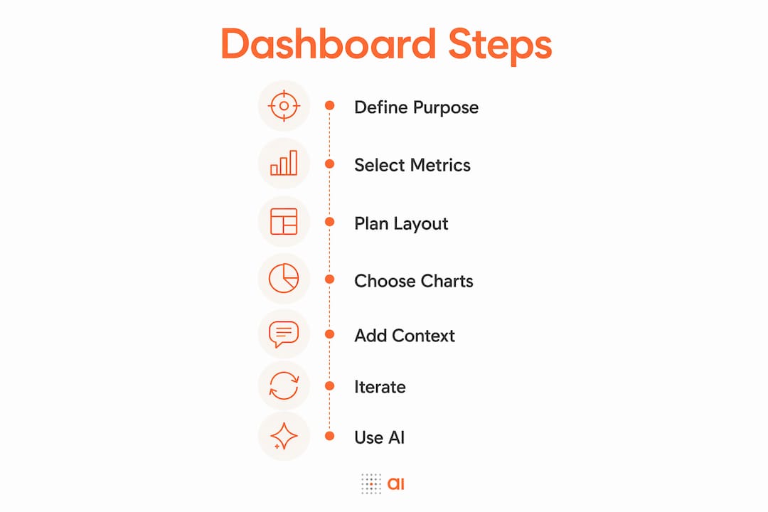
1. Select only metrics that drive decisions
Every metric on your dashboard should answer one question: “If this number changes, will someone do something differently?” If the answer is no, cut it. Experts consistently find that dashboards fail because of data overload, and that removing metrics which don’t inform decisions actually improves dashboard effectiveness.
A practical rule: limit yourself to a manageable number of KPIs per dashboard to avoid overload. If you need to track more, build a second dashboard for a different audience or function, rather than cramming everything onto one screen.
The difference between actionable and vanity metrics matters here. Monthly website visits is a vanity metric if nobody on your team changes their behavior based on it. Conversion rate by traffic source is actionable because it tells you where to spend your ad budget. When you’re deciding what to include, ask which category each metric falls into.
A few practical filters to apply:
- Does this metric connect directly to a goal or target?
- Can someone take a specific action based on a change in this number?
- Is this data accurate and reliably updated?
- Would removing it leave a meaningful gap in the story?
Pro Tip: Before finalizing your metric list, run it by one other person who will use the dashboard. If they can’t immediately explain why each number matters, simplify further.
2. Plan your layout before you build anything
Layout is where most beginners lose time. They add charts as they think of them, then spend hours rearranging. A few minutes of planning upfront saves a lot of frustration.

The “above the fold” rule applies here just as it does on a webpage: your most critical metrics should be visible without scrolling. Put your headline KPIs at the top, supporting charts in the middle, and detailed breakdowns at the bottom.
Group related metrics together. Revenue metrics in one section, marketing metrics in another, operational metrics in a third. This grouping reduces the cognitive load on anyone reading the dashboard because they know where to look for what they need.
Size communicates priority. A larger chart signals “this matters more.” Use that intentionally. Don’t make every panel the same size, or everything looks equally important, which means nothing stands out.
Whitespace is not wasted space. Crowding charts together makes dashboards harder to read, not more informative. Leave breathing room between sections.
3. Choose the right chart type for each metric
The wrong chart type can make accurate data misleading. Bar charts work best for comparisons, line charts show trends over time, and pie charts should only appear when you have fewer than five segments and you’re showing a genuine part-to-whole relationship.
KPI cards, those simple number-plus-label tiles, are underused by beginners. They’re perfect for headline metrics like total revenue, active users, or open support tickets. They’re fast to read and impossible to misinterpret.
Tables belong on dashboards when your audience needs to look up specific values, like top customers by revenue or inventory levels by SKU. They’re not great for spotting trends, but they’re excellent for reference.
A few quick guidelines:
- Use bar charts when comparing categories (revenue by region, leads by source)
- Use line charts when showing change over time (monthly MRR, weekly active users)
- Use KPI cards for single headline numbers with a comparison to a prior period
- Avoid pie charts for more than four or five segments; a bar chart is almost always clearer
- Let AI tools suggest chart types when you’re unsure; platforms like GoodData AI do this automatically
Pro Tip: If you’re using an AI-powered tool, type your question in plain English first and let the AI pick the chart type. You can always override it, but the suggestion is usually right.
4. Add context so numbers actually mean something
A number without context is just a number. “$84,000 in revenue this month” tells you almost nothing on its own. “$84,000 this month, up 12% from last month, and 8% below your quarterly target” tells you exactly where you stand and what to do next.

Adding context means including at least one of the following for each key metric: a comparison to a prior period, a target or benchmark, or a trend line that shows direction over time. Raw metrics tell you what happened; context tells you whether to celebrate or worry.
Label everything clearly. Chart titles should describe what the chart shows, not just name the metric. “Monthly Revenue vs. Target (Jan–Jun 2026)” is a useful title. “Revenue” is not. Use legends only when you have multiple data series, and keep them close to the data they describe.
Accessibility matters too. Avoid relying on color alone to convey meaning, since roughly 8% of men have some form of color vision deficiency. Use labels directly on data points where possible, and choose color combinations with sufficient contrast.
5. Iterate and evolve your dashboard with feedback
A dashboard built once and never touched is a dashboard that slowly becomes useless. Business priorities shift, teams change, and metrics that mattered six months ago may no longer drive decisions. Scheduling a quarterly review of your dashboard is one of the highest-leverage habits you can build.
At each review, ask: is every metric still informing a decision? If not, remove it. Are there new questions the business is asking that the dashboard doesn’t answer? Add them. Is the data still accurate and refreshing on schedule?
Collect feedback from the people who actually use the dashboard. They’ll tell you what’s confusing, what’s missing, and what they never look at. That feedback is more valuable than any design principle.
Manual CSV-based dashboards go stale fast because someone has to remember to update them. Connecting live data sources solves this problem at the root. When your dashboard pulls directly from your CRM, billing tool, or spreadsheet, the numbers update automatically and you stop making decisions on last week’s data.
6. Use AI-powered no-code tools to build faster
The biggest shift in dashboard creation over the past two years is that you no longer need to configure data connections manually or choose chart types yourself. AI-powered no-code platforms let non-technical users build integrated dashboards quickly compared to traditional tools.
The workflow is straightforward. You connect your data sources, type what you want to see in plain English, and the platform generates the dashboard. Tools that support natural language queries let you describe desired metrics and receive fully built charts, with no SQL required.
Gainable takes this further by reading your existing spreadsheets and building a full working application from them, including dashboards, authentication, and live data sync back to the source. You point it at an Excel file or Google Sheet, and it generates the app from your columns. Platforms like GoodData AI and Pulse AI follow a similar pattern, connecting to common business tools and generating visualizations on demand. For a broader look at no-code dashboard builders available in 2026, the options have expanded considerably.
When choosing a tool, prioritize these qualities:
- Direct connections to the data sources you already use (HubSpot, Stripe, Google Sheets, Airtable)
- Natural language input so you can describe what you want without configuring charts manually
- Automatic data refresh so your dashboard stays current without manual exports
- Sharing and permissions controls so the right people see the right data
Pro Tip: Start with one data source and one question. Build that single chart, verify the numbers against a source you trust, then expand. Trying to connect five sources at once before validating anything is how dashboards end up with wrong numbers that nobody catches.
7. Establish KPIs that actually measure success
KPIs, or key performance indicators, are the specific metrics you’ve agreed mean the business is on track. The word “key” does real work here. A KPI dashboard typically displays a curated set of important metrics, not everything you could possibly measure.
Good KPIs share a few traits. They’re tied to a specific goal (“grow MRR by 15% this quarter”). They’re measurable with data you actually have. And they change behavior when they move in the wrong direction. If a metric going red doesn’t prompt anyone to do anything, it’s not a KPI, it’s decoration.
Connect each KPI to a target. “Conversion rate: 3.2% (target: 4%)” is useful. “Conversion rate: 3.2%” is less so. The gap between current and target is where the decision lives. You can build team dashboards from existing data quickly once you’ve locked in which KPIs actually matter for your team.
8. Keep your dashboard simple and free of clutter
Simplicity is a design decision, not a limitation. The most effective dashboards show fewer things more clearly, not more things at once. Every chart you add competes for attention with every other chart.
A few practices that keep dashboards clean:
- One theme per dashboard. If you’re tracking sales performance, don’t add HR metrics because you have the data.
- Remove decorative elements. Gradients, 3D effects, and heavy borders add visual noise without adding information.
- Use consistent colors. Pick one color for positive trends, one for negative, and stick to them throughout.
- Avoid duplicate information. If a KPI card already shows total revenue, you don’t need a pie chart breaking it down by category on the same screen unless that breakdown is itself a key metric.
The goal is a dashboard someone can read in under 30 seconds and walk away knowing exactly what needs attention.
9. Choose tools that work for non-technical users
The right tool for a beginner is one that removes technical barriers without removing control. You want to be able to connect your data, describe what you want, and get a working dashboard without needing a developer.
Look for these features when evaluating options:
- No-code setup: connecting data sources and building dashboards should take 20–30 minutes, not days
- Natural language input: you should be able to describe charts in plain English
- Live data sync: the dashboard should update automatically, not require manual exports
- Sharing controls: you need to control who sees what, especially with financial data
- Templates: starter layouts save time and give you a proven structure to build from
Gainable fits this profile for teams whose data lives in spreadsheets or CRMs. You can explore Gainable’s data connectors for HubSpot, Stripe, Airtable, Salesforce, and more. For teams evaluating broader AI-powered project tools, the market has matured significantly in 2026 and the no-code category now covers most common business use cases without requiring technical staff.
10. Apply accessibility and usability principles
A dashboard that only works for one person isn’t really a team tool. Usability means anyone on your team can open it, understand it, and act on it without asking for a tutorial.
Accessibility goes further. It means the dashboard works for people with visual impairments, color blindness, or cognitive differences. These aren’t edge cases, they’re real members of your team.
Practical steps:
- Use high-contrast color combinations (dark text on light backgrounds, or vice versa)
- Never use color as the only way to signal a status; pair it with a label or icon
- Keep font sizes readable at normal screen distances (14px minimum for body text in charts)
- Add alt text or descriptions to charts when embedding dashboards in documents or portals
- Test your dashboard on a mobile screen; many people check metrics on their phones
Usability and accessibility aren’t separate concerns from good design. They’re the same thing. A dashboard that’s easy to read for someone with low vision is also easier to read for everyone else.
Key Takeaways
Building a dashboard without technical skills is entirely achievable when you start with clear questions, limit your metrics to what drives decisions, and use AI-powered no-code tools to handle the data connections and chart generation.
| Point | Details |
|---|---|
| Start with questions, not data | Write 3–5 specific business questions before opening any tool or choosing metrics. |
| Limit KPIs to 5–10 per dashboard | More metrics create overload; every included metric should change behavior when it moves. |
| Use AI tools to build dashboards quickly | No-code AI platforms let non-technical users build integrated dashboards without SQL or coding. |
| Add context to every key metric | Always show a prior-period comparison, a target, or a trend line alongside raw numbers. |
| Review and update quarterly | Dashboards go stale; remove metrics that no longer inform decisions and add new ones as priorities shift. |
Ready to build your first dashboard without the technical headache?
Gainable turns your existing spreadsheets and CRM data into live, working applications with dashboards built in. Point it at your Excel file or Google Sheet, and it reads your columns, merges your data sources, and generates a real interface with authentication, live updates, and audit logs. No prompts, no coding, no manual exports.
Your team keeps working in the app. You keep your spreadsheet. The copy-paste loop disappears.
See how it works or explore Gaia Autopilot, which watches your app data for anomalies and drafts actions for you to approve before anything slips through the cracks.