

A sales dashboard built from CRM data is a live visual display that turns raw deal records into clear performance signals your team can act on. The industry term for this practice is CRM sales reporting, and it sits at the center of modern sales analytics. When you create sales dashboards from CRM data correctly, you stop chasing spreadsheets and start making faster calls on pipeline health, rep performance, and revenue forecasts. Companies using CRM analytics see up to 29% higher sales productivity because sellers spend less time hunting for data and more time selling. That number alone makes the case for getting this right.
Which key sales metrics and KPIs should you track in a CRM sales dashboard?
The first decision you make shapes everything else: which numbers actually matter. Best practices recommend 5–7 core KPIs before you build anything. Fewer metrics keep the display focused and decision-oriented. More than seven and you end up with a wall of numbers that nobody reads.
The most useful KPIs for a sales performance dashboard fall into three categories:
Pipeline health
- Total open deals and their combined value
- Number of deals by stage
- Average deal age (how long deals sit before moving or dying)
Revenue performance
- Monthly recurring revenue or monthly closed revenue
- Win rate (closed won divided by total closed)
- Average deal size
Rep activity
- Calls or emails logged per rep per week
- Last activity date per deal (a powerful early warning signal)
Each KPI should connect directly to a decision. Total open deals tells you whether your pipeline is full enough to hit quota. Win rate tells you whether your pitch is working. Average deal age tells you where deals stall. If a metric does not change how you act, cut it.
Pro Tip: Start with revenue and pipeline KPIs only. Add rep activity metrics in month two, once your team trusts the dashboard and uses it daily.
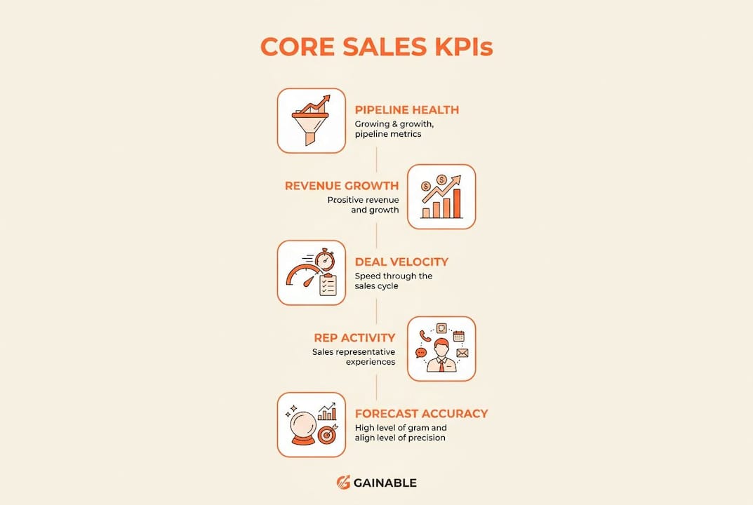
The goal of sales metrics visualization is not to impress anyone with data volume. It is to give every person in the room one clear answer to “where do we stand right now?”
What are the prerequisites and tools needed to build a CRM sales dashboard?
Before you touch a chart, you need clean data and the right fields. Skipping this step is the most common reason dashboards fail within the first month.

The six backbone fields
Sales directors can build a live pipeline dashboard from a CRM export in about 10 minutes using just six fields. Those fields are:
| Field | What it tells you |
|---|---|
| Deal Name | Identifies the specific opportunity |
| Stage | Shows where the deal sits in your pipeline |
| Amount | Quantifies the revenue potential |
| Close Date | Anchors forecasting and urgency |
| Owner | Attributes performance to a rep |
| Last Activity Date | Flags deals going cold |
If your CRM export contains these six columns and the data is clean, you have everything you need to start.
Data hygiene comes first
Inconsistent naming conventions and merged cells cause dashboard errors and false insights. This is not a minor inconvenience. A deal stage labeled “Proposal” in one record and “proposal sent” in another creates two separate buckets in your chart, splitting your pipeline view in half. Standardize every dropdown value, remove merged cells from exports, and delete blank rows before you import anything.
Good data handling practices for managers include setting CRM field rules at the source, so reps cannot type free text into stage or owner fields. That one change prevents most hygiene problems before they start.
Pro Tip: Run a quick audit of your Stage field values before building. If you find more than eight unique values, consolidate them. Anything beyond eight stages usually signals inconsistent data entry, not a genuinely complex pipeline.
Choosing your tool
Your tool choice depends on how often your data changes and who needs access. Spreadsheet-based options work for small teams with weekly exports. No-code CRM dashboard platforms work better when you need real-time updates and role-based access. Enterprise platforms add governance and data warehouse connections but require more setup time. Match the tool to your actual refresh cadence, not your aspirational one.
How to build your sales dashboard step by step from CRM data
A clear process keeps you from building a dashboard that looks good but answers the wrong questions. Follow these steps in order.
-
Define your KPIs first. Write down the 5–7 metrics you chose in the previous section before opening any tool. This prevents you from building charts just because the data is there.
-
Export or connect your CRM data. Pull the six backbone fields. If your tool supports a live connection to HubSpot, Salesforce, or Airtable, use it. Live connections eliminate the manual export step entirely.
-
Select the right chart type for each metric. Chart selection is functional, not aesthetic. Pipeline stages suit bar charts because you are comparing discrete categories. Revenue over time suits line charts because you are tracking a continuous trend. Using a pie chart for time-based data obscures the trend and misleads the reader.
-
Apply filters. Add date range filters, rep filters, and stage filters. Filters let one dashboard serve multiple audiences without building separate views for each team.
-
Arrange your layout with purpose. Revenue KPIs belong at the top of the dashboard, pipeline data in the middle, and rep-level metrics at the bottom. This hierarchy matches how executives, managers, and reps each scan the page. The most important number should be impossible to miss.
-
Set permissions and sharing rules. Decide who sees what before you share the link. Reps typically see their own deals and team totals. Managers see all reps. Executives see revenue and forecast only. Role-based access keeps the dashboard relevant for each viewer and prevents information overload.
- Use consistent color coding across all charts. One color per stage, one color per rep.
- Label every chart with a plain-English title. “Deals by Stage” beats “Pipeline Distribution Q2.”
- Add a “last updated” timestamp so viewers know how fresh the data is.
You can build team dashboards fast from existing CRM data without starting from scratch every time. The key is reusing your layout template and swapping the data source when you need a new view.
How to maintain and refine your CRM dashboard for ongoing results
Building the dashboard is the easy part. Keeping it useful is where most teams fall short.
Successful teams treat dashboards as living tools reviewed and refined monthly. Business goals shift, product lines change, and new reps join. A dashboard that perfectly reflected your pipeline in january may be misleading by april if nobody updated the stage definitions or KPI targets.
The most common mistakes that kill dashboard adoption:
- Treating the dashboard as a static report that gets exported to PDF and emailed weekly
- Adding new metrics without removing old ones, until the view becomes cluttered
- Failing to train reps on why the dashboard exists, so they ignore it
- Letting data hygiene slip after launch, which corrupts the charts over time
“The biggest mistake is treating dashboards as static reports rather than evolving tools that require constant refinement. A dashboard that nobody updates is just a snapshot of a moment that no longer exists.”
To keep your dashboard alive, schedule a monthly 30-minute review. Check whether each KPI still connects to a current business decision. Remove any metric that has not changed a decision in the past 60 days. Add new metrics only when a specific question comes up repeatedly in sales meetings.
Automated sales dashboards shift your team’s role from manual data cleanup to strategic analysis. When the data refreshes automatically, your weekly sales meeting stops being a data reconciliation session and starts being an actual strategy conversation.
Key Takeaways
The most effective way to create sales dashboards from CRM data is to start with clean backbone fields, define 5–7 focused KPIs, match each metric to the right chart type, and treat the dashboard as a living tool that evolves with your business.
| Point | Details |
|---|---|
| Start with six backbone fields | Deal Name, Stage, Amount, Close Date, Owner, and Last Activity Date are all you need to begin. |
| Limit KPIs to 5–7 | Fewer metrics keep the dashboard focused and make decisions faster and clearer. |
| Match chart type to metric | Use bar charts for pipeline stages and line charts for revenue trends to avoid misleading visuals. |
| Fix data hygiene first | Standardize CRM field values before building to prevent errors and false insights in your charts. |
| Review dashboards monthly | Update KPIs and layout as business goals change to keep the dashboard relevant and trusted. |
Why most sales dashboards fail before they start
I have seen sales teams spend weeks building a dashboard and abandon it within a month. The reason is almost never the tool. It is the order of operations.
Most teams open their CRM, export everything they can find, and start dragging fields into charts. They end up with 15 metrics, three different color schemes, and a layout that requires scrolling to find revenue. Nobody uses it after week two.
The teams that get this right do the opposite. They write down the three questions their VP of Sales asks every Monday morning. Then they build exactly enough dashboard to answer those three questions. Nothing more. That constraint forces clarity, and clarity drives adoption.
Data hygiene is the other thing I cannot stress enough. I have watched a single inconsistent stage label split a pipeline view in half and send a sales director into a panic over a “missing” $400,000 in deals. The deals were there. The data was not clean. Fixing the label took five minutes. The panic took an hour to resolve.
The shift from manual reporting to automated CRM analytics is real and worth pursuing. But automation built on dirty data just delivers wrong answers faster. Get the foundation right first, then automate.
— Rickard
How Gainable turns your CRM data into live sales dashboards
Gainable connects directly to HubSpot, Salesforce, Airtable, Stripe, and other sources to pull your CRM data into a unified model automatically. No exports, no manual refreshes, and no code required.
From that live data, Gainable generates custom sales pipeline apps and dashboards that reflect your actual pipeline stages, deal owners, and revenue targets. You can refine any view by typing a plain-English query. Gaia Autopilot monitors your data continuously, flags anomalies, and drafts suggested actions before bottlenecks become problems. Gainable’s data connectors handle the integration layer so your team focuses on decisions, not data plumbing.
FAQ
What is a sales dashboard built from CRM data?
A sales dashboard built from CRM data is a live visual display that converts deal records, stage data, and rep activity into charts and KPIs your team can act on in real time.
How many KPIs should a CRM sales dashboard include?
Best practices recommend 5–7 core KPIs to keep the dashboard focused and decision-oriented. More than seven metrics typically creates information overload and reduces usability.
What CRM fields do you need to create a sales dashboard?
Six fields cover most use cases: Deal Name, Stage, Amount, Close Date, Owner, and Last Activity Date. A clean export of these six columns is enough to build a functional pipeline dashboard.
Why does data hygiene matter for CRM dashboard creation?
Inconsistent field values and naming conventions cause chart errors and split data into false categories. Standardizing your CRM inputs before building prevents misleading visuals and wrong conclusions.
How often should you update a sales performance dashboard?
Successful teams review and refine their dashboards monthly. Regular reviews keep KPIs aligned with current business goals and prevent the dashboard from becoming an outdated snapshot.