

You already have the data. It lives in your CRM, your spreadsheets, your project management tool, or your ERP. The problem is that it just sits there, scattered and silent, while your team makes decisions based on gut feel or last week's email thread. Learning to create team dashboards from existing data is not about collecting more information. It is about finally making the information you already have visible, shared, and useful. This guide walks you through every step: preparing your data, choosing the right tool, building your dashboard, and keeping it alive as your team grows.
Key takeaways
| Point | Details |
|---|---|
| Start with data quality | Clean, consistent data before you connect anything saves hours of troubleshooting later. |
| Match the tool to your team | Choose a platform based on your team's technical comfort and your data sources, not just popularity. |
| Build reports first, then dashboards | In tools like Power BI, detailed reports come first; dashboards surface only the key visuals. |
| Treat filters as core features | Interactive filters are not optional extras. They are what make a dashboard actually useful for self-service. |
| Keep metrics consistent | Standardize your KPI definitions across dashboards to prevent different team members reading different numbers. |
Gathering and preparing your existing data
Before you touch any dashboard tool, you need to know what data you are working with and whether it is ready to be visualized. Skipping this step is the single biggest reason teams end up with dashboards that look polished but deliver wrong answers.
Start by identifying every relevant data source your team uses. Common sources include:
- CRM platforms (like HubSpot or Salesforce) for sales pipeline and customer data
- Spreadsheets for financial tracking, project timelines, or inventory
- Project management tools for task completion rates and workload distribution
- Accounting software for revenue, expenses, and cash flow
- Marketing platforms for campaign performance and lead volume
Once you have your list, check each source for quality issues. Look for duplicate records, inconsistent date formats, missing values in key fields, and column names that vary across files. A sales spreadsheet where one tab calls it "Close Date" and another calls it "Closed On" will cause real problems when you try to merge them into a single view.
The next step is organizing your data so it connects cleanly to your chosen tool. This usually means standardizing column headers, converting date fields to a consistent format, and removing rows that are clearly test data or errors. If you are pulling from multiple sources, decide on a primary key, such as a customer ID or order number, that links records across systems.
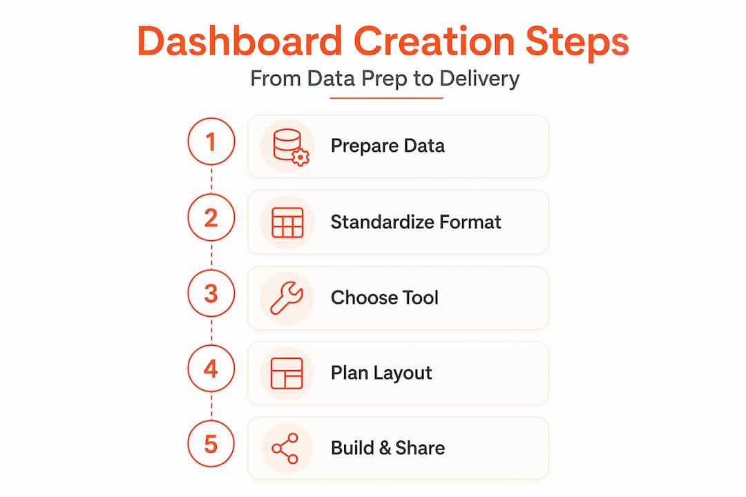
Most modern dashboard tools support common formats including CSV, Excel, Google Sheets, JSON, and direct database connections. Knowing your format upfront saves you from discovering mid-build that your tool cannot read your file.
Pro Tip: Before connecting any data source, run a quick row count and spot-check five to ten records manually. If the numbers look off at the source, they will look worse on a dashboard.
Choosing the right tool and planning your layout
Picking the wrong platform is a costly mistake. Not because switching is impossible, but because rebuilding a dashboard from scratch after your team has already started using it is demoralizing and time-consuming. The right choice depends on three things: where your data lives, how technical your team is, and how much interactivity you need.
Here is a practical comparison of three widely used options:
| Tool | Best for | Data sources | Technical skill needed |
|---|---|---|---|
| Power BI | Teams with Microsoft 365 data | Excel, SQL, SharePoint, APIs | Low to medium |
| Databricks | Teams with large or complex datasets | Data lakes, SQL, cloud storage | Medium to high |
| Excel with AI tools | Small teams with spreadsheet data | CSV, Excel files | Low |
Power BI works well for most business teams because it connects directly to Microsoft products and has a drag-and-drop interface. The key insight from Microsoft's own guidance is that effective dashboards come from building detailed multi-page reports first, then pinning only the most critical visuals to a single dashboard canvas. This keeps your dashboard clean and focused.
Databricks suits data-heavy teams or those with engineering support. It lets you define dimensions and measures visually using local metric views, which is useful when you are still prototyping what your KPIs should look like before locking them in.
For smaller teams, AI-assisted Excel dashboards have become genuinely practical. Tools like ChatGPT and Claude can generate pivot tables, suggest chart types, and even build out slicer configurations, making interactive dashboards accessible without any specialized training.
Before you open any tool, spend thirty minutes planning your layout on paper or a whiteboard. Define the three to five KPIs your team actually makes decisions from. Map out who will use the dashboard and what question each visual answers. A dashboard that tries to answer every question answers none of them well.

Pro Tip: Write down the single most important question your dashboard should answer in one sentence. Every visual you add should either answer that question directly or provide context for it. If it does neither, leave it out.
Step-by-step process to build your dashboard
With your data prepared and your tool selected, here is how the actual build works. This process applies broadly, with tool-specific notes where relevant.
-
Connect your data source. Open your dashboard tool and create a new project or workspace. Import your cleaned data file or connect directly to your source system. In Power BI, this is done through "Get Data." In Databricks, you connect to your catalog or upload a file. Verify the row count matches your source before moving on.
-
Create your base report or data model. In Power BI, build your detailed report pages first. Add calculated columns or measures for any KPIs that require formulas, such as conversion rate or average deal size. In Databricks, local metric views let you define these calculations visually inside the dashboard before promoting them to shared global views.
-
Build your visualizations. Add charts, tables, and summary cards one at a time. Match the chart type to the question: bar charts for comparisons, line charts for trends over time, and single-number cards for at-a-glance KPIs. Keep color use minimal. One accent color for highlights is enough.
-
Pin or arrange key visuals. In Power BI, you pin visuals from reports to a new dashboard canvas. The dashboard becomes a curated one-page summary, while the underlying report holds the detail. Note that Power BI dashboards are single-page canvases and do not support cross-filtering between tiles the way reports do, so reserve your dashboard for summary views only.
-
Add interactive filters. This is where a static report becomes a real team performance dashboard. In Databricks, filter widgets like date range pickers and dropdown selectors can apply across multiple datasets simultaneously, letting team members slice the data without needing to rebuild anything. In Power BI, slicers serve the same purpose on report pages.
-
Test with real users before sharing. Sit with one or two teammates and watch them use the dashboard without coaching them. Note where they get confused or ask questions the dashboard does not answer. Adjust before the broader rollout.
-
Set up refresh schedules. A dashboard showing last month's data is a historical document, not a decision tool. Configure automatic data refresh so your team always sees current numbers.
Pro Tip: Build your first version with half the visuals you think you need. You can always add more. Starting lean forces you to prioritize what actually matters and makes it easier for teammates to give useful feedback.
Sharing dashboards and keeping them effective
Getting the dashboard built is only half the job. The other half is making sure it stays accurate, stays used, and keeps improving over time.
Start with permissions. Most platforms let you share dashboards with view-only or edit access. Give your full team view access and limit edit rights to one or two people who understand the data model. This prevents accidental changes that break calculations without anyone noticing.
For ongoing collaboration, treat interactive filters as first-class UI elements, not afterthoughts. When team members can filter by date range, region, or product category on their own, they stop sending you requests for custom reports. That is a significant time saver for whoever owns the dashboard.
Metric consistency deserves special attention. If your sales team defines "qualified lead" differently than your marketing team, your dashboard will show numbers that contradict each other. In Databricks, promoting local metric views to global Unity Catalog views enforces consistent definitions across every dashboard in your organization. In Power BI, shared datasets serve a similar function.
A few practices that keep dashboards healthy over time:
- Schedule a monthly five-minute review to check that data is still refreshing correctly
- Ask your team quarterly whether the dashboard still answers the questions they care about
- Document any formula or metric definition changes with a date and a reason
- Use version control and audit trails when multiple team members have edit access, so you can roll back mistakes
The teams that get the most value from dashboards are the ones that treat them as living documents, not finished products.
My honest take on what actually works
I have watched teams spend weeks building dashboards that nobody opens after the first month. The pattern is almost always the same: too many visuals, no clear ownership, and metrics that were never agreed on before the build started.
In my experience, the teams that get this right do one thing differently. They start with a conversation, not a tool. They sit down and agree on three questions the dashboard must answer, and they refuse to add anything that does not serve those questions. That constraint feels limiting at first. It is actually what makes the dashboard useful.
I am also skeptical of the instinct to pick the most powerful tool available. I have seen sales teams thrive with a well-built Excel dashboard connected to their CRM export, while engineering teams with access to Databricks produce dashboards nobody understands. The right tool is the one your team will actually use without needing a tutorial every time.
One more thing: do not underestimate the value of interactive filters. When I have seen teams move from static reports to dashboards with dynamic date and category filters, the number of ad hoc data requests drops noticeably. People stop waiting for someone else to pull a custom report and start exploring the data themselves. That shift in behavior is worth more than any chart type or color scheme.
— Rickard
How Gainable makes this faster
Building dashboards from scratch takes time, even when you follow every step correctly. If your team is working from spreadsheets, HubSpot data, or Stripe transaction records, there is a faster path.
Gainable connects directly to your existing data sources and auto-generates team apps and dashboards that reflect your actual workflows, without requiring any coding. You can refine what gets displayed using plain language queries, so you are not locked into whatever the default layout produces. Built-in communication tools keep team discussions tied directly to the data being discussed, which means less context-switching and fewer misread numbers. For teams that want to turn spreadsheets into team apps without a multi-week build process, Gainable is worth exploring.
FAQ
What does it mean to create a dashboard from existing data?
It means connecting data you already have, such as spreadsheets, CRM exports, or database tables, to a visualization tool that displays it as charts, tables, and KPI cards your team can interact with.
Do I need coding skills to build team dashboards?
Not always. Tools like Power BI and AI-assisted Excel dashboards are designed for non-technical users. Platforms like Gainable go further by generating dashboards automatically from your connected data sources.
How do I keep dashboard metrics consistent across my team?
Agree on KPI definitions before you build, and use shared data models or global metric views when your tool supports them. In Databricks, promoting to global views prevents different team members from seeing different numbers for the same metric.
What is the difference between a dashboard and a report?
A dashboard is a single-page summary showing your most important KPIs at a glance. A report is a multi-page document that supports deeper exploration. In Power BI, dashboards are curated from report visuals and are optimized for quick decisions, not detailed analysis.
How often should I update my team dashboard?
Set up automatic data refresh so the numbers stay current without manual effort. Review the dashboard structure itself quarterly to make sure it still reflects the questions your team is actually trying to answer.